Teaching People How to Stay Healthy Has Come a Long Way
From plague crosses on doors to billboard campaigns, public health education has taken some creative graphic approaches.
When the plague swept through England in the 1660s, it killed some 100,000 Londoners. To warn of disease, “plague crosses” marked victims’ doors, along with the words “Lord have mercy upon us.”
Public health warnings have evolved since then. In the book and exhibit “Can Graphic Design Save Your Life?” designers Lucienne Roberts and Rebecca Wright examine how public health messages are communicated. By the 19th century, Roberts says, mass media, medical science, and graphic design were adept at teaching people about health and disease. Tuberculosis inspired the United States’ first big health-education campaign, with one poster discouraging “careless spitting, coughing, sneezing.” The number of deaths fell steadily between 1900 and 1940.
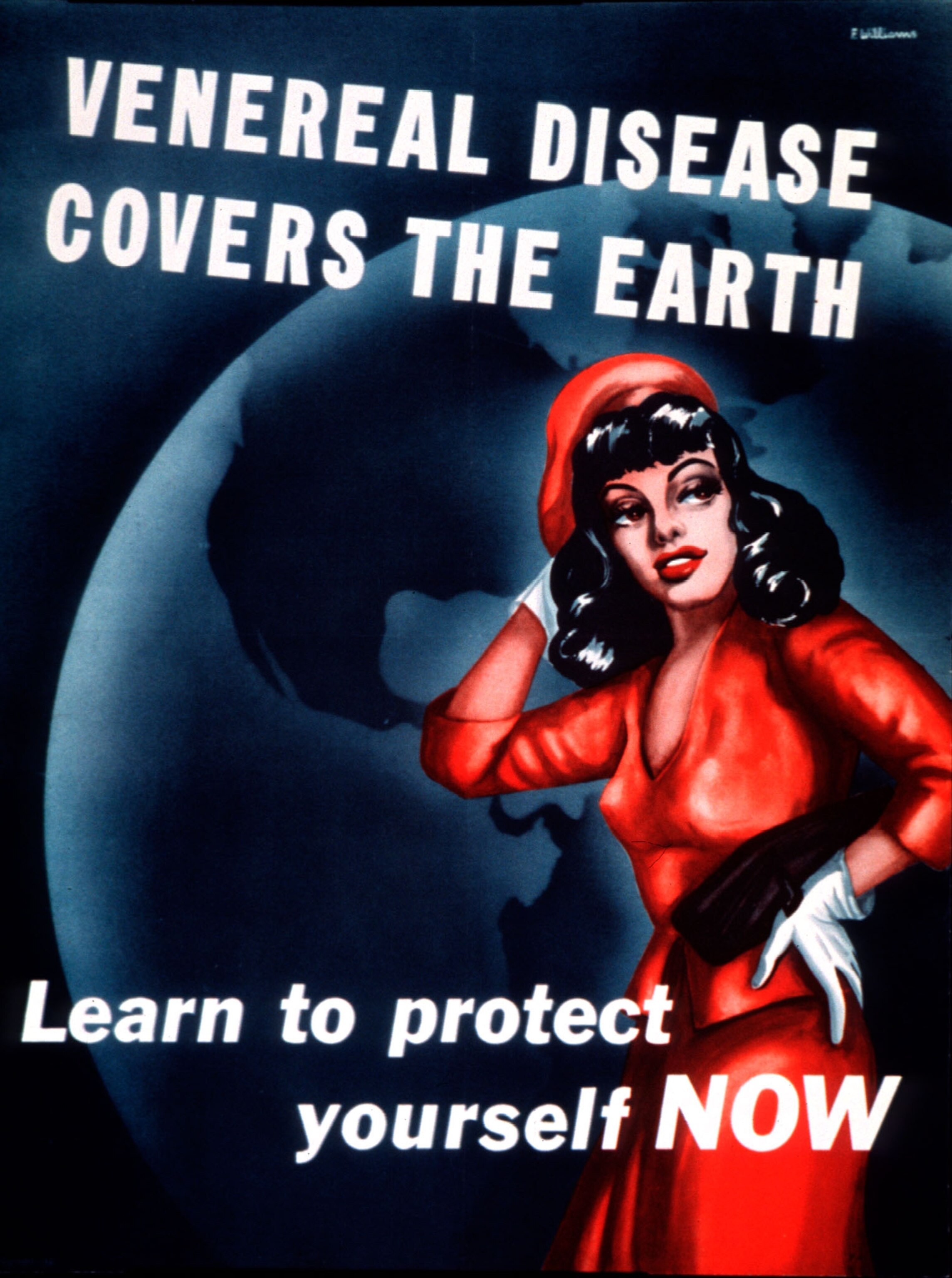
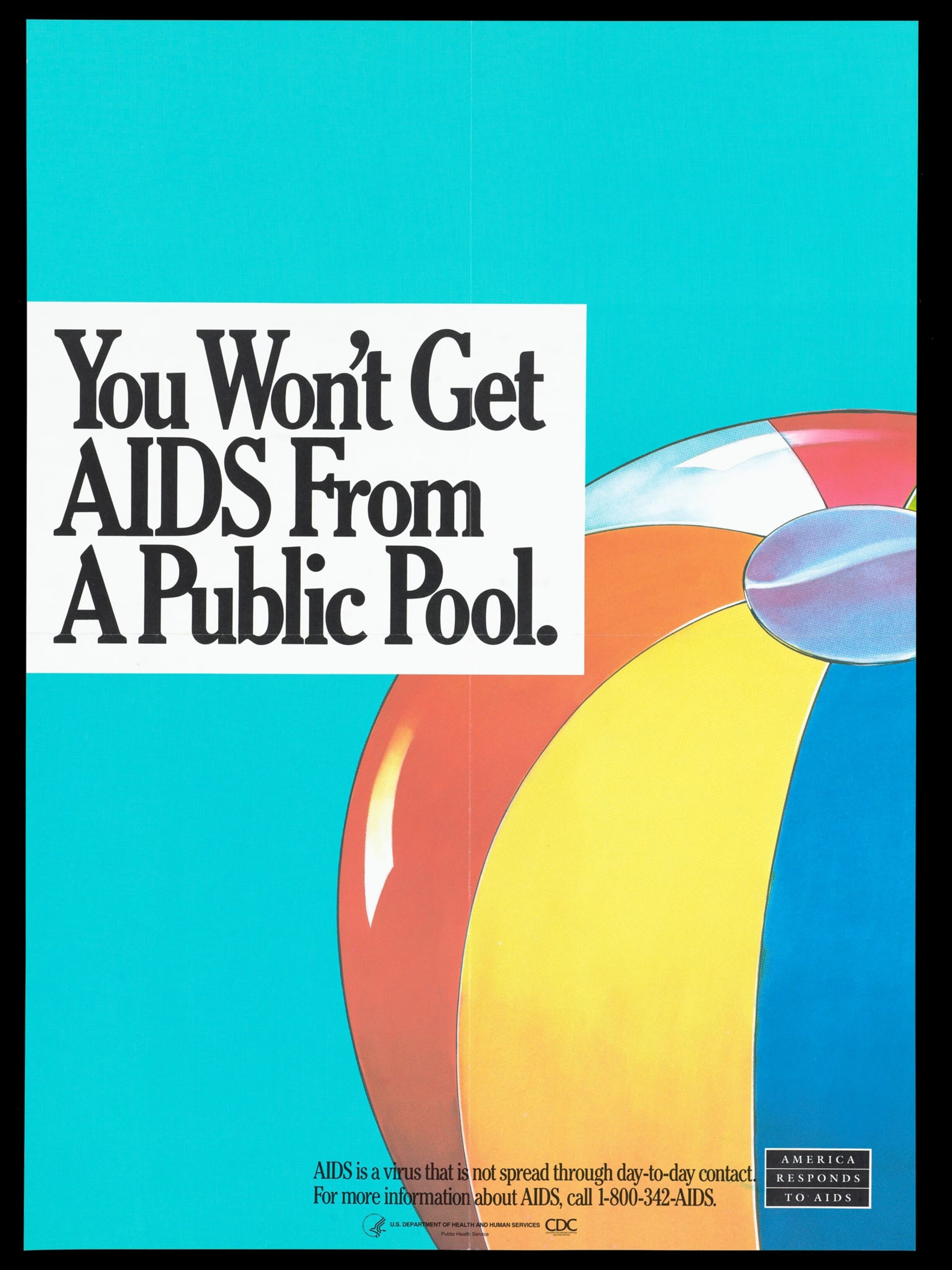
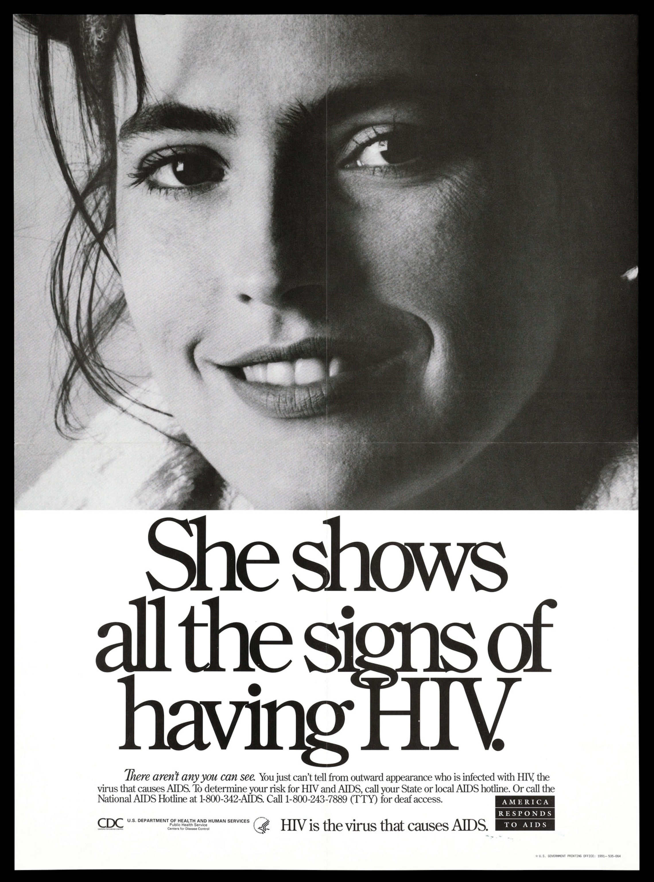
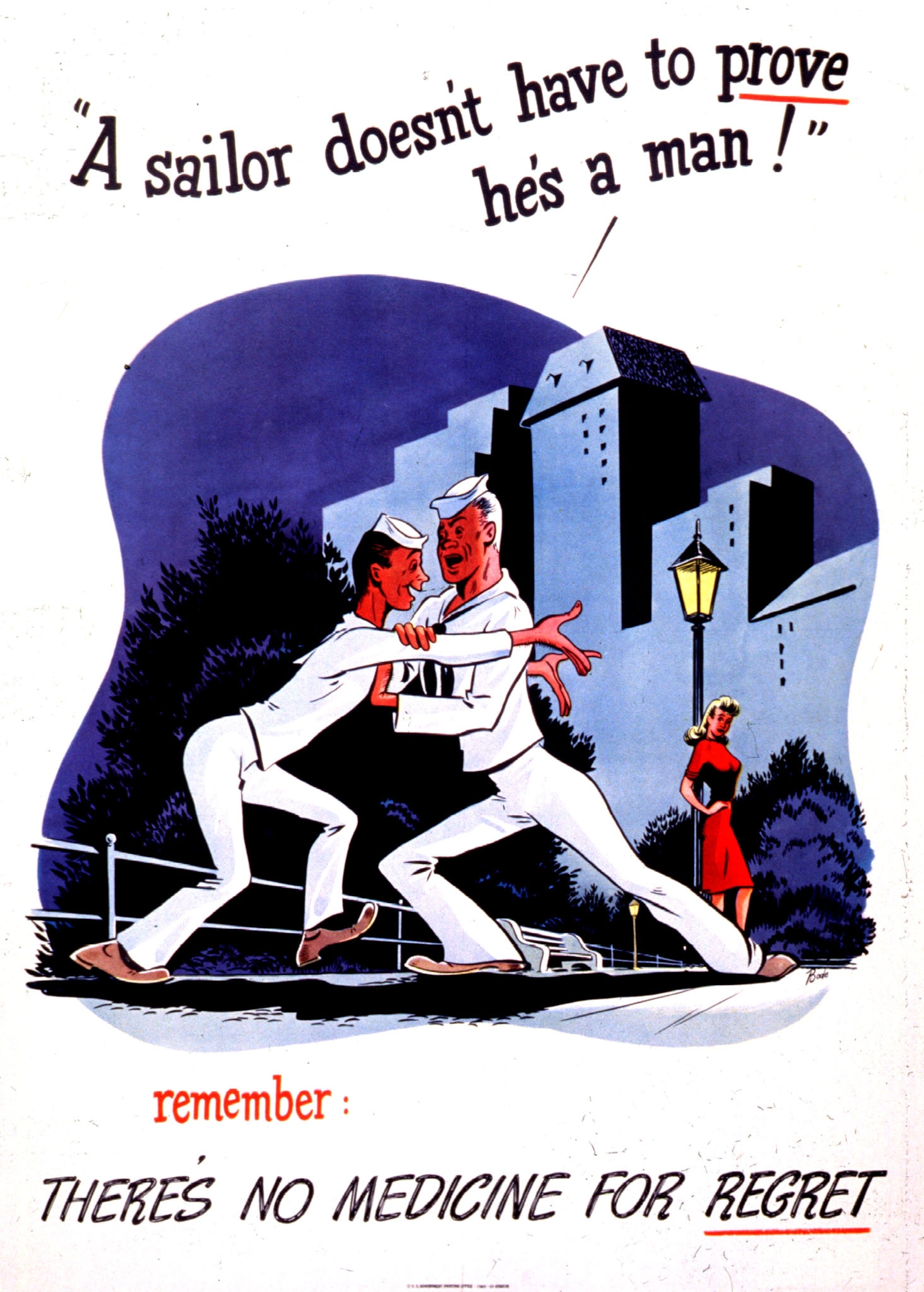
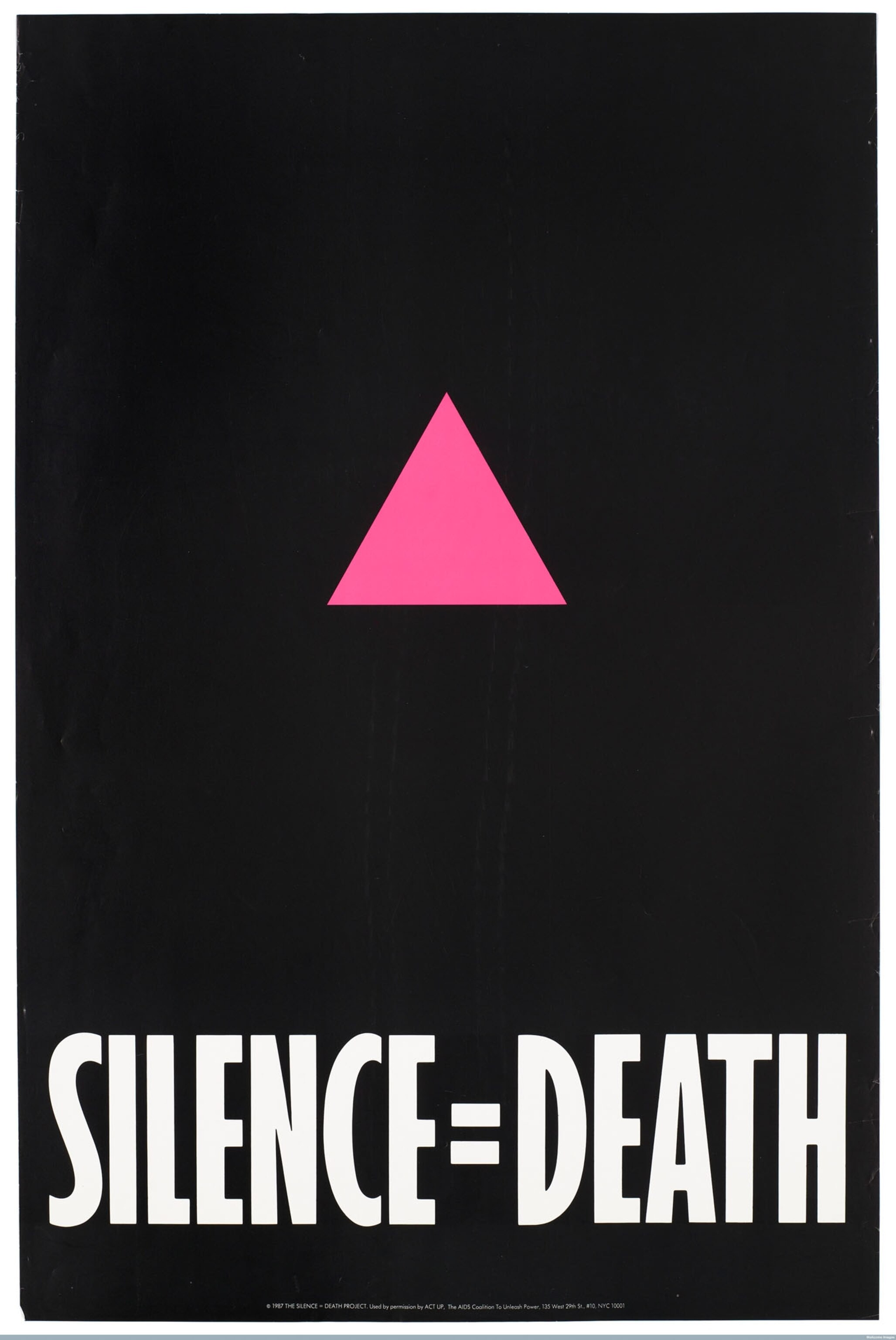
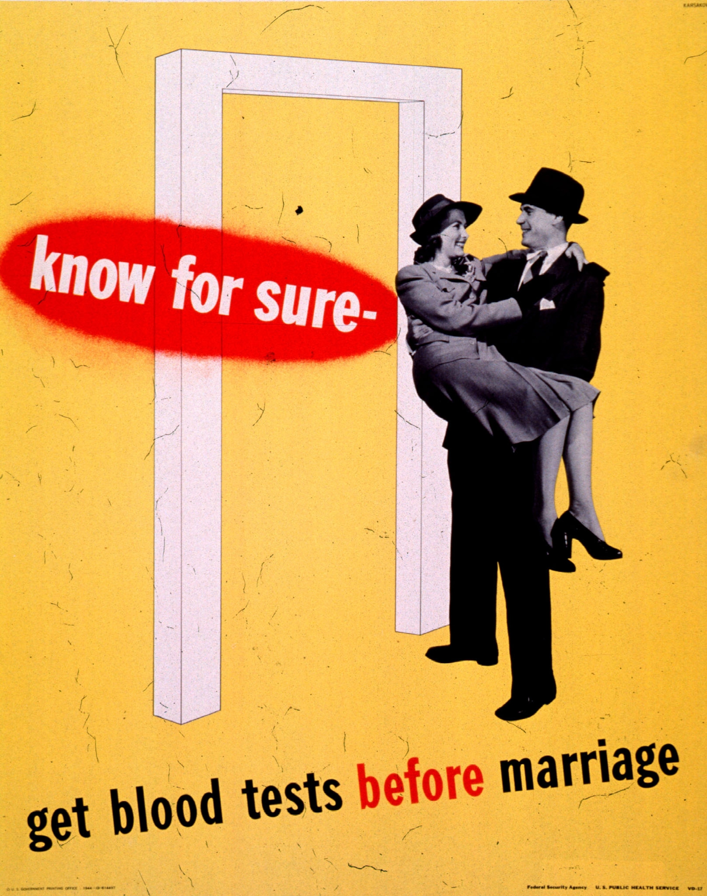
Both world wars sparked campaigns against sexually transmitted diseases. World War I–era posters warned soldiers against promiscuity while pointedly avoiding words such as “syphilis” and “gonorrhea.” By World War II, language was more explicit: “You can’t beat the Axis if you get VD,” scolded one American poster. Starting in the 1980s, posters corrected misinformation about HIV/AIDS and urged condom use.
Roberts says that the link between design and public health extends beyond publicity campaigns. Some U.K. hospitals revamped emergency room signs to better inform people about wait times and triage. This helped drive a 50 percent decline in violent waiting room outbursts, she says: “The root thing that needed to change [was] information.”
Graphic design’s influence on public health can be lasting. A red cross once warned of plague’s presence. Now a different take on the symbol is one of the world’s most recognizable icons—and a reassuring beacon of health and safe haven.
